This is not a season that moves in a single direction. Spring Summer 2026 is built on a refined tension between opposites: on one side, the energy of saturated colors, often used in monochrome looks or bold, unexpected combinations; on the other, the calm precision of warm neutrals, rich in texture and understated sophistication. Two distinct languages that coexist without conflict.
The result is not a fixed palette, but a fluid system of expression. Color is no longer just decorative, it becomes rhythm, mood, and intent.
Intensity as a statement of presence
Intensity as a statement of presence
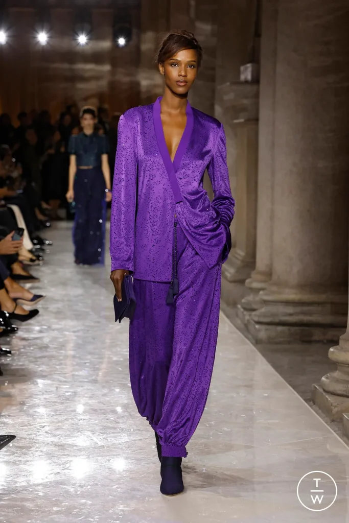
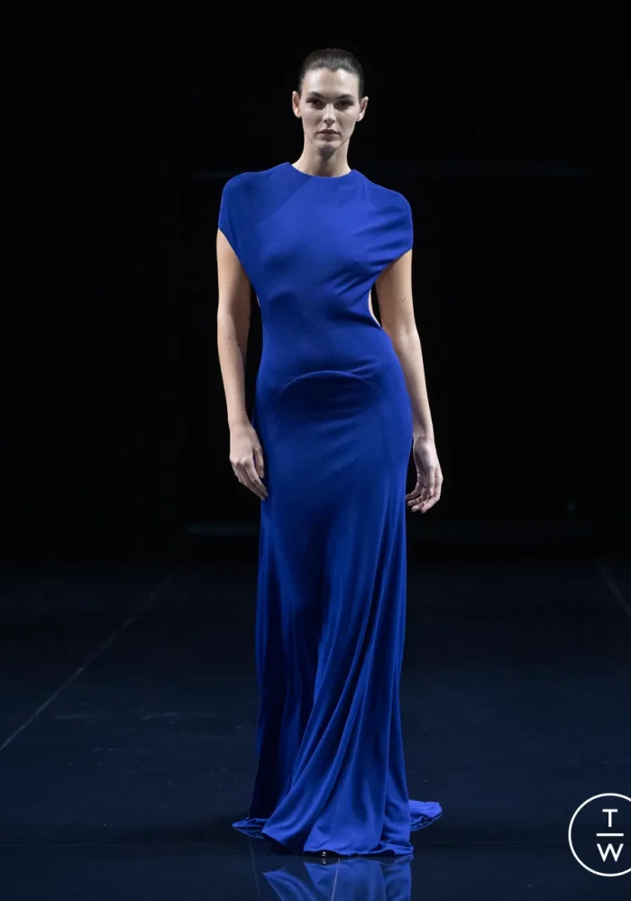
Brighter tones return with a stronger, more conscious attitude. This is not about excess, but about clarity. Deep reds, saturated blues, full-bodied greens, and sharp accents of yellow or orange define looks that often unfold in monochrome, where a single hue becomes the entire visual structure.
At the same time, color expands into contrast. Combinations become freer, almost instinctive, pairing unexpected shades or building harmony through tonal proximity. The energy comes not from chaos, but from the dialogue between colors.
Monochrome, in particular, stands out as a deliberate choice. A single color explored through different materials, depths, and finishes creates dimension without breaking visual continuity.
The quiet strength of warm neutrals
The quiet strength of warm neutrals
At the other end of the spectrum, neutrals evolve rather than fade into the background. Beige, sand, cream, caramel, and earthy tones move beyond the idea of a base palette and become protagonists in their own right. These are colors that don’t rely on impact, they build presence through subtlety.
Their richness lies in materiality. Soft fabrics, matte or gently luminous surfaces, relaxed volume, all contribute to making neutrals feel layered rather than minimal. They are never flat, but textured, almost dimensional.
Warm neutrals define a new kind of understated luxury, where refinement is expressed through continuity rather than contrast.
Two directions, one balance
Two directions, one balance
The essence of the season lies in the dialogue between these two worlds. Intense colors find grounding in neutrals, while neutrals gain depth when paired with stronger hues. There is no hierarchy, only balance.
A look can start from a neutral base and be activated by a single bold element. Or it can be built entirely around a saturated tone, softened by texture and subtle variation. In both cases, color becomes a tool for composition, not just expression.
Even tonal dressing within neutrals plays a key role: beige layered over beige, cream on cream, sand on sand. A visual continuity that highlights form and material over contrast.
How to wear it now
How to wear it now
During the day, neutrals lead with ease. Tonal outfits, clean silhouettes, lightweight materials. A foundation that allows shape and light to take priority.
Brighter colors appear as accents: a single piece, a defined detail, an interruption that doesn’t break the harmony but enhances it.
In the evening, the shift becomes more defined. Intense hues take center stage, often in total looks. Neutrals remain present, but in supporting roles, balancing, framing, refining.
Because in this season, color is never just decoration. It is structure, atmosphere, and language. Above all, it is a continuous negotiation between presence and restraint.